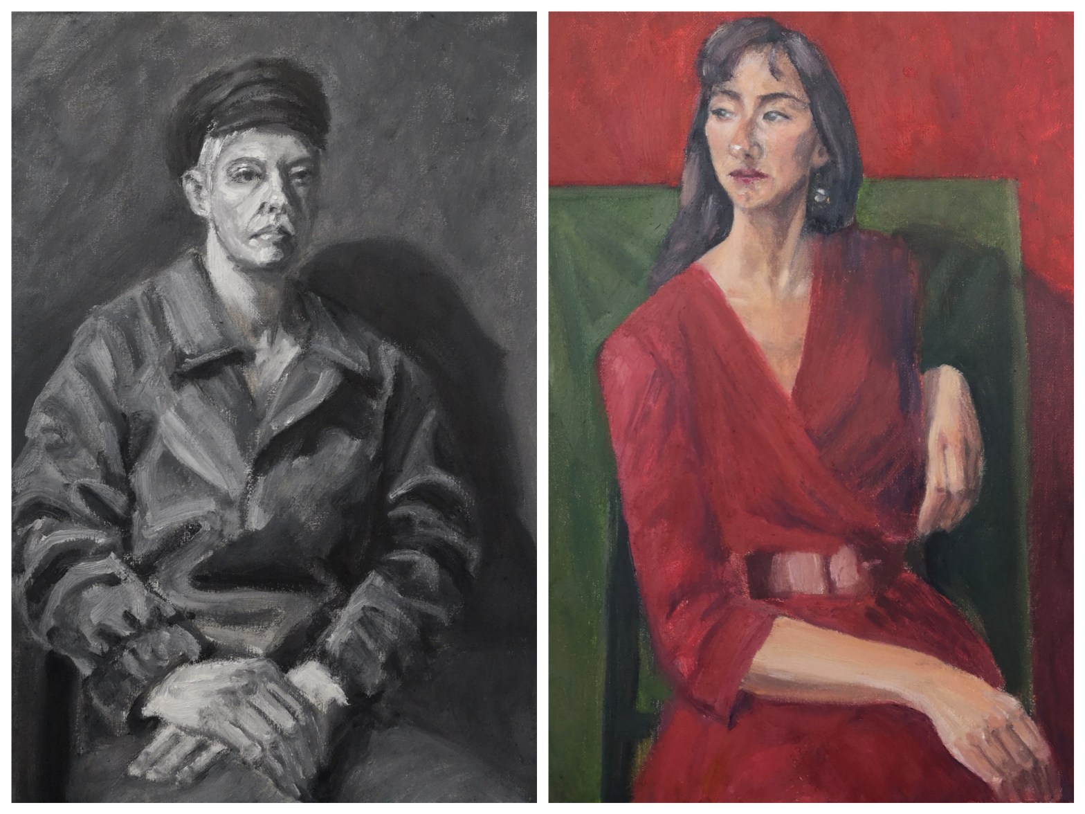
The first portrait I painted under the turtorship of Atul Vohora at Heatherley’s was a black and white study, or rather a study using grey tones, from very dark to very light, mixed out of black and white oil paints.
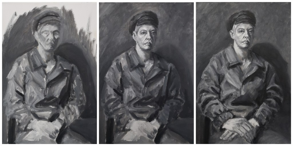
Working in monochrome presented similarities with my previous printmaking project, and allowed me to create a graphic and contrasted portrait.
The lack of colour emphasises a certain solemnity, or resoluteness I perceived in the sitter. Combined to the rigid oversized coat, the greyness also contributed to masculinising the sitter, giving her an androgynous facet.

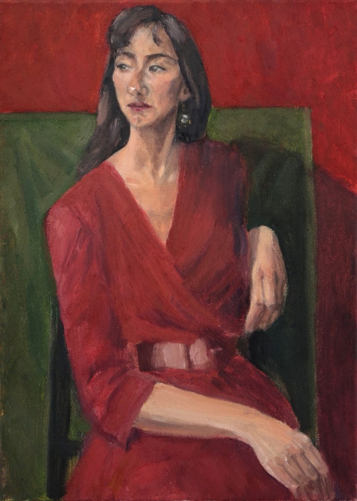
For the second portrait of the project, the model changed, and colour was introduced, presenting an added difficulty compared to painting in black and white.
Indeed, painting with colours means not only thinking about value (dark to light), but also temperature (warm to cool), tone (the relative lightness or darkness of a colour) and saturation (the intensity of the colour).

Using a limited palette of primary colours, the resulting portrait focuses on the sitter’s red dress matching the red background and her distant gaze. The red of the dress and background allude to the woman’s youth, vitality and determination, in spite of her seamingly relaxed pose.
Although quite different, especially because of the difference of the palettes used (greyscale versus primaries), to me both portraits offer a similarity in terms of underlying a certain resoluteness and assertivity of the two different women depicted.
